

Google UX Design Certificate Case Study - Dunder Mifflin
2025
Goal: The goal of this project was to create a case study for the Google UX Design Certificate Course by imagining Dunder Mifflin’s digital presence by designing a modern e-commerce experience that transforms the traditional paper company into a customer-centric brand. The case study focuses on improving product discoverability, streamlining the ordering process, and reinforcing Dunder Mifflin’s identity as a trusted, approachable supplier for businesses of all sizes.
Role: Sole Designer
Target Audience
Office administrators managing recurring supply orders
Small business owners seeking dependable bulk purchasing options
Corporate buyers looking for consistent quality and pricing
Home office users who want easy online ordering and fast delivery
Now that I knew my target audience, I crafted some example user personas to assist me with better understanding my users.
User Personas
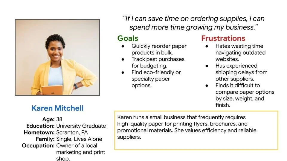
User Persona 1 - Karen Mitchell
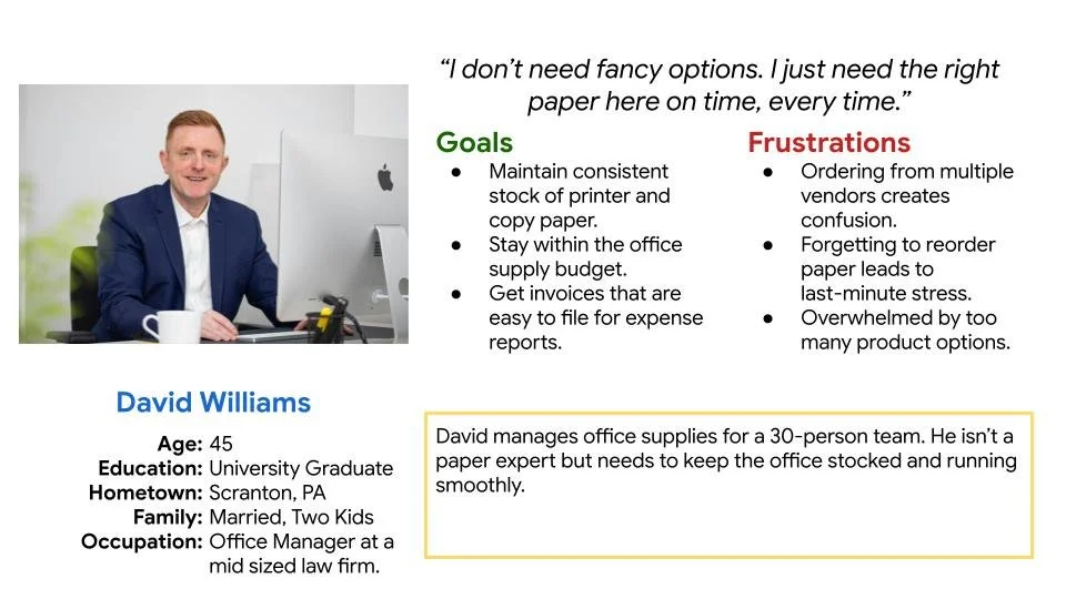
User Persona 2 - David Williams
Key Challenges and Constraints
Modernizing a Legacy Brand
Balancing Dunder Mifflin’s well-known, nostalgic identity with the need for a modern, professional e-commerce experience required careful design decisions to avoid losing its charm.Limited Brand Consistency
Existing assets (logos, colors, typography) lacked cohesion, making it difficult to establish a unified visual system that felt authentic yet updated.Balancing Fictional and Real-World Context
Since Dunder Mifflin originates from The Office, there was a challenge in grounding the experience in realism while still nodding to the show’s playful cultural roots.Solo Project Under Tight Timeline
As the sole designer, I handled all aspects of the project — from research and wireframing to branding and final UI — within a condensed timeframe, requiring quick decision-making and efficient execution.
Research Conducted
At the start of the project, I conducted foundational research to understand Dunder Mifflin’s brand position, user needs, and the competitive landscape within the office supply industry. The goal was to identify how a legacy brand could remain relevant and appealing in a digital-first market.
I began by exploring user expectations for online office supply purchasing — focusing on how customers search for products, compare prices, and reorder supplies efficiently.
Competitive Landscape
To benchmark modern standards, I conducted a competitive audit report and analyzed several leading competitors.

Amazon Business – Known for speed, convenience, and personalization, but lacking brand warmth and human connection.

Staples – Offers a professional, structured browsing experience but can feel overly corporate.
Office Depot / OfficeMax – Provides detailed product categorization but suffers from visual clutter and outdated design conventions.
WB Mason– Focuses on small businesses with loyalty incentives and a friendly tone, but with limited differentiation in user experience.
Through this analysis, it became clear that Dunder Mifflin’s opportunity lay in combining the efficiency of large competitors with a distinctly human, personable brand identity, a balance few in the market had achieved.
Initial Concepts and Design Strategy
Sketches and Wireframes
After completing the research phase, I translated key insights into paper sketches to establish the structure and flow of the new Dunder Mifflin app. For this stage, I prioritized getting ideas on to paper and identifying the initial concepts of the app.
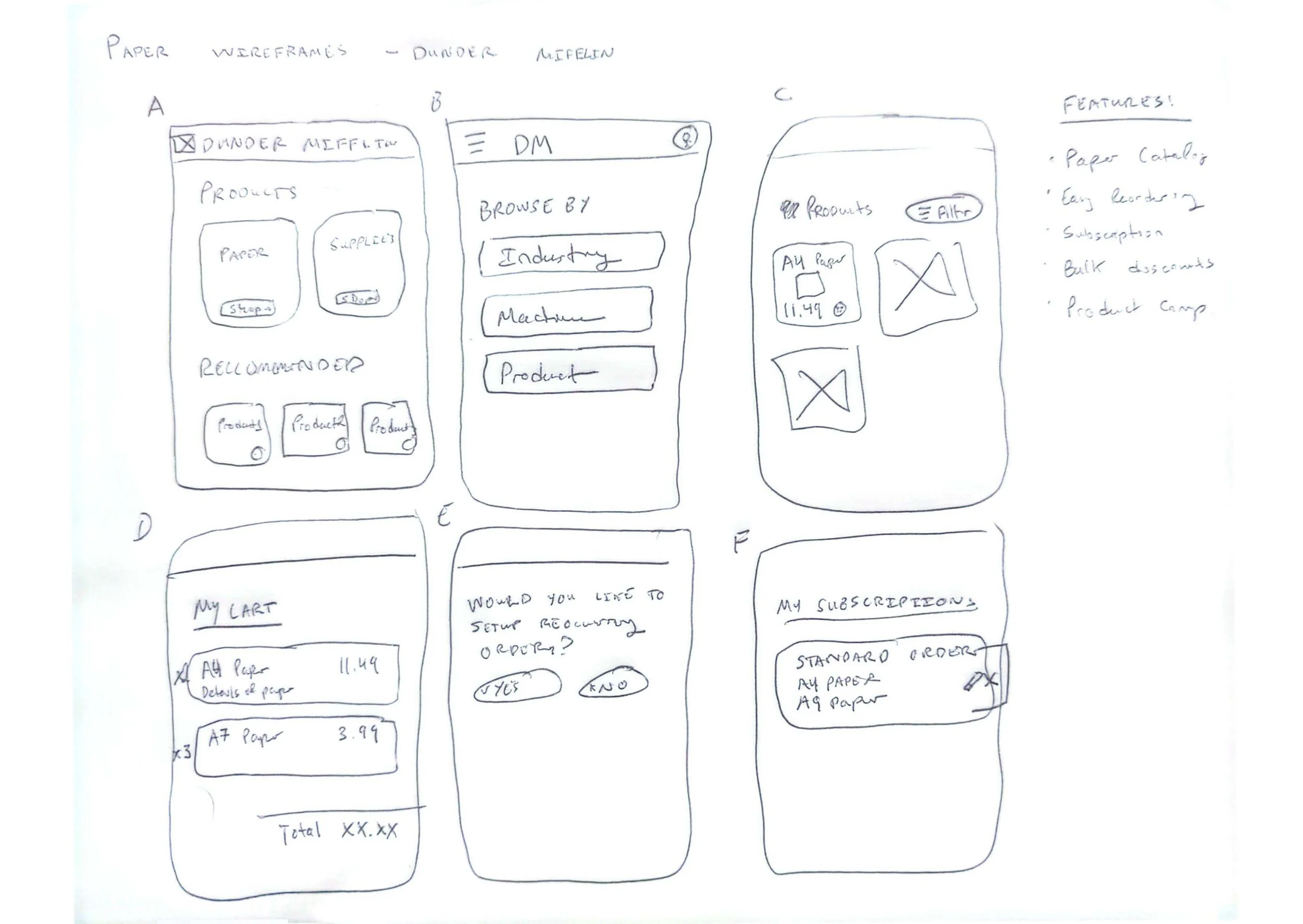
Initial Paper Wireframes
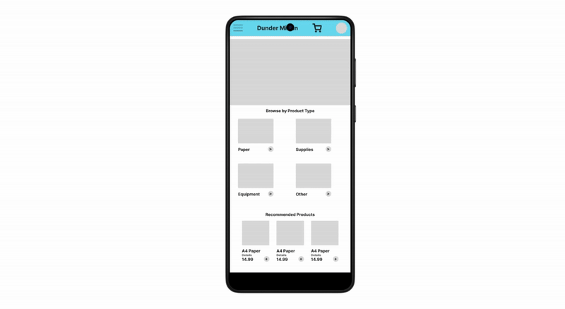
After completing the wireframes I moved to creating a set of low fidelity mockups based on these designs. I knew what I was making wasn’t perfect, but it would help me to identify the flaws in my approach.
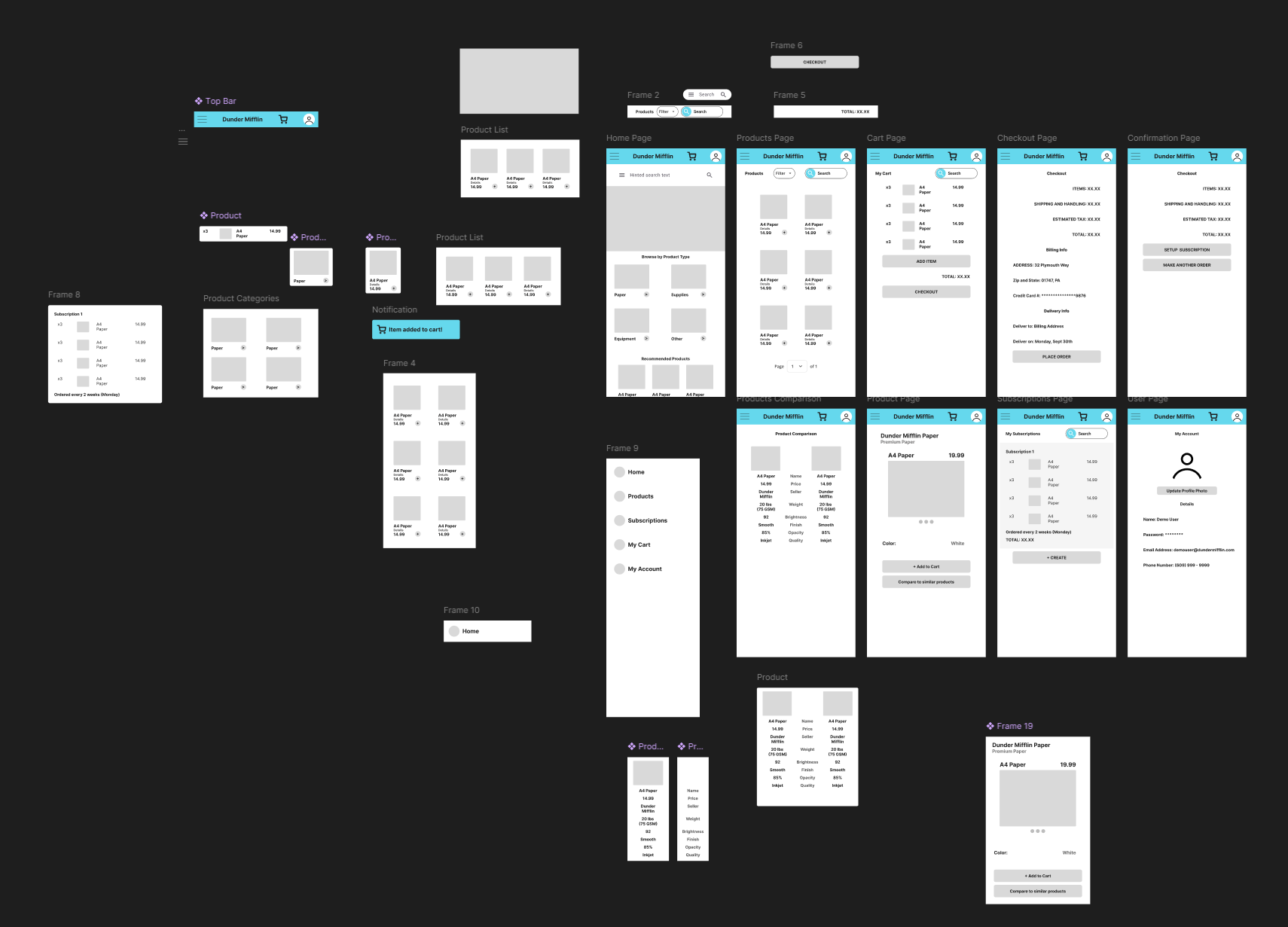
Initial Low Fidelity Prototype
Once I was done with creating the low fidelity wireframes I connected some of the pages and tested my mockup using Figma’s present feature.
Initial Low Fidelity Wireframes
Upon seeing the initial low fidelity prototype, I was able to realize many flaws with my design:
There was far too much unused whitespace on the bottom of the app.
The navigation felt clunky and not easy to navigate.
The checkout process was not complete.
So I felt it was time to perform a Usability Study to see if my users agreed.
Usability Study for Initial Designs
To inform the design, I conducted a usability study on some of the mockups I created for Dunder Mifflin’s app to understand how users interacted with the experience and where they encountered friction. Participants included a few of my close friends who go through the process of ordering supplies for their companies - part of a potential customer base.
The study revealed key insights:
Users struggled to locate specifics about a given product.
Found the checkout process confusing.
Felt the navigation provided was unintuitive.
These findings helped to shape my design decisions, guiding improvements to navigation, product details, and visual hierarchy to create a more intuitive and engaging user experience.
Sitemap

Sitemap
Color Palette
Since Dunder Mifflin was already an established brand, I decided to keep the color palette simple and based on the original blue color.

Dunder Mifflin Color Palette
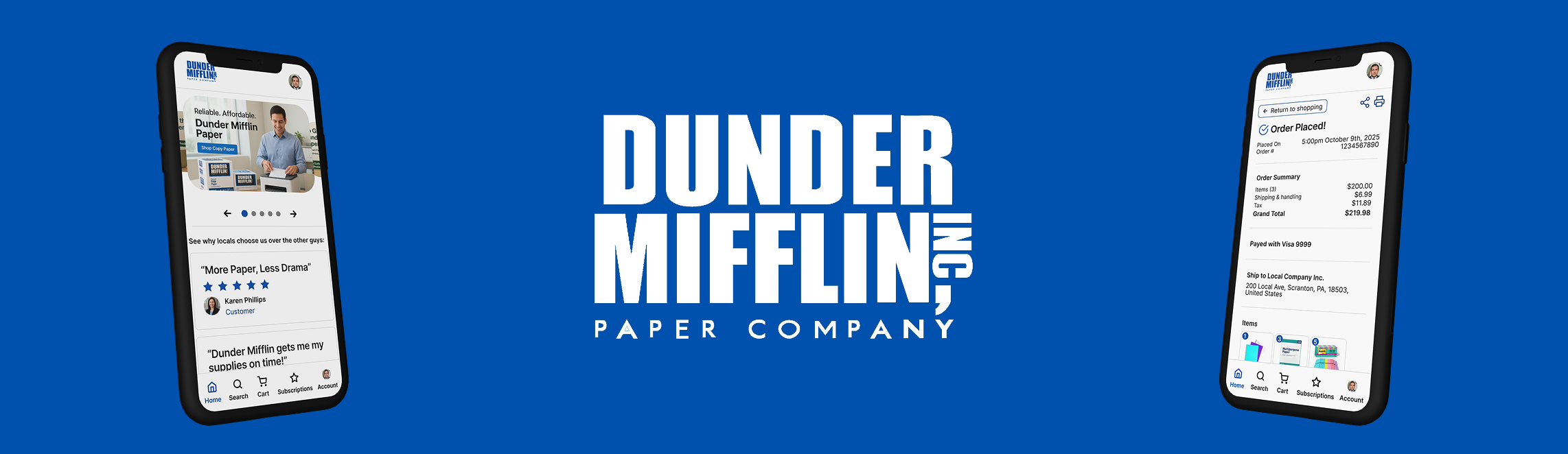
Final Polished Designs

Final Mockups

Final Prototype
Conclusions
The Dunder Mifflin design successfully transformed a nostalgic, paper-based brand into a modern digital experience that feels both credible and character-driven. By grounding design decisions in research and usability testing, I was able to create a platform that balances functionality and personality — making it easier for users to find, order, and trust Dunder Mifflin as their go-to office supply provider.
Working solo on this project challenged me to move quickly and think holistically, managing every stage from research to final UI design within a tight timeline. The process reinforced the importance of aligning brand identity with user experience, especially for companies with strong cultural recognition.
In the end, the project showcases how thoughtful design can modernize even the most traditional industries, proving that a company like Dunder Mifflin can stay true to its roots while evolving to meet the needs of today’s customers.